Simple Linear Regression with Excel
Contents
Introduction and Data
This example demonstrates how to perform simple linear regression using Microsoft Excel 2013. The dataset used in this demonstration is kfm. The variables are:
| Variable | Description |
|---|---|
no |
A numeric vector, identification number |
dl_milk |
A numeric vector, breast-milk intake (dl/24h) |
sex |
A factor with levels boy and girl |
weight |
A numeric vector, weight of child (kg) |
ml_suppl |
A numeric vector, supplementary milk substitute (ml/24h) |
mat_weight |
A numeric vector, weight of mother (kg) |
mat_height |
A numeric vector, height of mother (cm) |
Data as CSV: Here is the complete data set, in CSV format.
   "no",    "dl_milk",    "sex",    "weight", "ml_suppl", "mat_weight",  "mat_height"
    1,       8.42,    "boy",     5.002,      250,         65,         173
    4,       8.44,    "boy",     5.128,        0,         48,         158
    5,       8.41,    "boy",     5.445,       40,         62,         160
   10,       9.65,    "boy",     5.106,       60,         55,         162
   12,       6.44,    "boy",     5.196,      240,         58,         170
   16,       6.29,    "boy",     5.526,        0,         56,         153
   22,       9.79,    "boy",     5.928,       30,         78,         175
   28,       8.43,    "boy",     5.263,        0,         57,         170
   31,       8.05,    "boy",     6.578,      230,         57,         168
   32,       6.48,    "boy",     5.588,      555,         58,         173
   36,       7.64,    "boy",     4.613,        0,         58,         171
   39,       8.73,    "boy",     5.882,       60,         54,         163
   54,       7.71,    "boy",     5.618,      315,         68,         179
   55,       8.39,    "boy",     6.032,      370,         56,         175
   72,       9.32,    "boy",     6.030,      130,         62,         168
   78,       6.78,    "boy",     4.727,        0,         59,         172
   79,       9.63,    "boy",     5.345,       55,         68,         172
   80,       5.97,    "boy",     5.359,       10,         60,         159
   81,       8.39,    "boy",     5.320,       20,         59,         174
   82,      10.43,    "boy",     6.501,      105,         76,         185
   83,       5.62,    "boy",     4.666,       80,         52,         159
   84,       6.84,    "boy",     4.969,       80,         54,         165
   90,      10.35,    "boy",     6.105,        0,         78,         174
   91,       4.91,    "boy",     4.360,        0,         49,         162
   98,       7.70,    "boy",     5.667,        0,         63,         165
    6,      10.03,   "girl",     6.100,        0,         58,         167
   14,       7.42,   "girl",     5.421,       45,         67,         175
   25,       5.00,   "girl",     4.744,       30,         73,         164
   26,       8.67,   "girl",     5.800,       30,         80,         175
   27,       6.90,   "girl",     5.822,        0,         59,         174
   34,       6.89,   "girl",     5.081,       20,         53,         162
   37,       7.22,   "girl",     5.336,      590,         58,         160
   38,       7.01,   "girl",     5.637,      100,         63,         170
   40,       8.06,   "girl",     5.546,       70,         61,         170
   41,       4.44,   "girl",     4.386,      150,         58,         167
   43,       8.57,   "girl",     5.568,       30,         70,         172
   46,       5.17,   "girl",     5.169,        0,         65,         160
   47,       7.74,   "girl",     4.825,      210,         58,         176
   56,       7.93,   "girl",     5.156,       20,         74,         165
   57,       5.03,   "girl",     4.120,      100,         55,         162
   63,       7.68,   "girl",     4.725,      100,         50,         160
   65,       6.91,   "girl",     5.636,       30,         49,         161
   66,       8.23,   "girl",     5.377,      110,         55,         167
   68,       7.36,   "girl",     5.195,       80,         59,         171
   74,       6.46,   "girl",     5.385,       70,         51,         165
   85,       7.24,   "girl",     4.635,       15,         48,         167
   88,       9.03,   "girl",     5.730,      100,         62,         172
  100,       4.63,   "girl",     5.360,      145,         48,         157
  104,       6.97,   "girl",     4.890,       30,         67,         165
  105,       5.82,   "girl",     4.339,       95,         47,         163
The Task: perform a linear regression using dl_milk as explanatory and weight as response.
Before you begin
You will need to install the Analysis Toolpak. You can do this by clicking File–>Add-Ins–>Analysis Toolpak.
Explore the data: Plotting
One of the most important first steps in any data analysis is to plot the data. To create a scatterplot in Excel, highlight the column including the independent variables and then the column containing the dependent variables. Click on Insert and select the basic scatterplot from the Charts menu. It is advised to verify that the axes are correct, with dl_milk on the y-axis and weight on the y-axis. Axis titles have been added and the scale has been adjusted in order to display only the relevant portion of the graph.
The least squares regression line can be displayed by right-clicking any point and selecting Add Trendline. The default is Linear. Selecting Display Equation and Display R-squared places these features on the graph as well.
It may also be helpful to display a LOESS smoother to gain insight into a relationship. However, this is a limitation of Excel. Jon Peltier has developed an add-in that may be useful to this end.
Here is the scatterplot that is created from the above instructions.
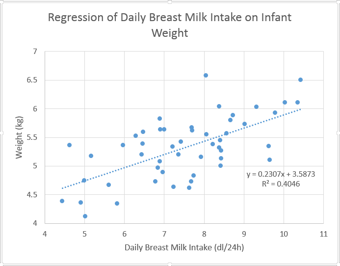
The scatterplot does show evidence of a positive linear trend, indicating that as the amount of daily breast milk intake increases, weight tends to increase. The dotted blue line is the least squares regression line, which will be discussed in greater detail in just a moment. For now, the data appear to follow this line well, indicating that simple linear regression may be appropriate.
Explore the data: Correlation
Correlation is a measure of the strength and direction of a linear relationship. The farther from 0 (and closer to 1 or -1), the stronger the relationship. The sign indicates whether the relationship is positive or negative. Choose a cell and enter the following equation:
=CORREL(B2:B51,D2:D51)

The correlation is determined to be .636, indicating a moderately strong, positive, linear relationship. This supports the conclusions made above.
Verifying Assumptions
When performing linear regression, we have several assumptions to check:
1. Linearity: There is a linear relationship between the independent and dependent variables. (The mean of the Y values is accurately modeled by a linear function of the X values)
2. Normality of the Errors: The random error term is assumed to have a normal distribution with a mean of zero.
3. Homoscedasticity: The random error term is assumed to have a constant variance.
4. Independence of the Errors: The errors are independent of each other.
5. No Perfect Multicollinearity: (For multiple linear regression) There is no perfect collinearity between independent variables.
Let’s look at these one-by-one.
Linearity of the Relationship
There is no reason to doubt the linarity of the mean based on the conclusions made in the initial exploration of the data.
Normality of the Residuals
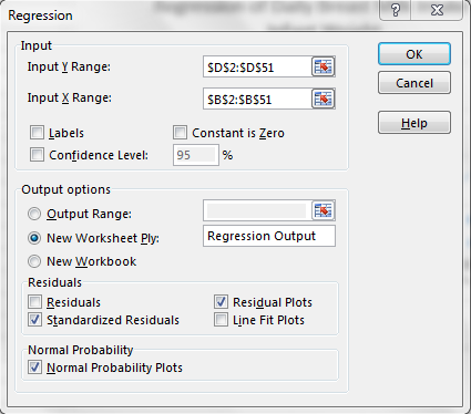
It is important to assume that the residuals of the regression line are normally distributed. Though this assumption can often be rejected using a visual approach (in the case of residuals that are clearly non-normal), it is more appropriate to use a formal test for normality. There is a way to do this without the Analysis Toolpak, but it is tedious. If the Data Analysis Toolpak is installed, click Data->Data Analysis->Regression. The data should be entered as shown below. Selecting “New Worksheet Ply” is advised, since the original worksheet will be crowded otherwise. The normal probability plot and residual plot are available here as well.
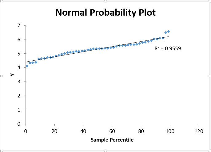
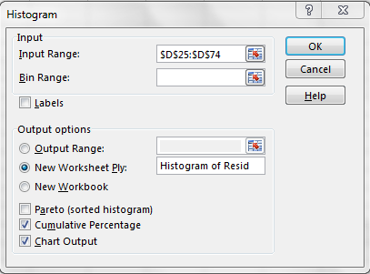
There is no reason to doubt the Normality of the residuals, as the Normality Plot appears linear (a trendline and relative R-squared have been added for reference). Another way to verify this assumption is to plot a histogram of the residuals. Select Data->Data Analysis->Histogram and use the Standardized Residuals from the Regression Output as the input variable. Here, an ogive has been overlayed by clicking Cumulative Percentage, though this is not necessary.
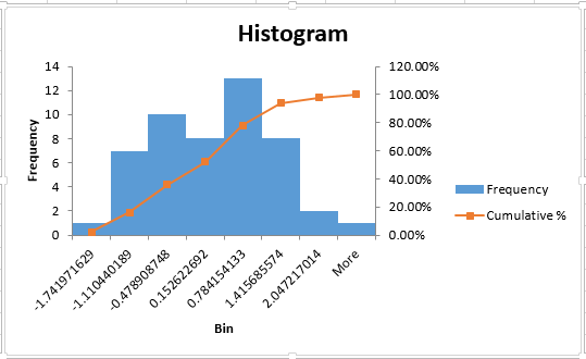
The histogram appears relatively Normal, but it may be necessary to perform a formal test for Normality. There are a few add-ins which are capable of performing these tests (NumXL and analyse-it to name a few). Using the graphical methods described above, it is concluded that the residuals are (relatively) Normally distributed.
Homoscedasticity
It is also important to verify that the variance of errors is relatively constant across all levels of the independent variable. Again, Excel cannot do this on its own, at least on a formal level. This can be verified visually, however, through the use of a residual plot (which was already output in the regression procedure).
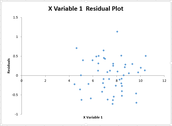
The graph does not show any evidence of fanning or pattern in the variance, so it is concluded that the assumption is met.
Independence of the Error Terms
A Durbin-Watson test is one way to assess the condition of whether or not the errors are independent of each other. The null hypothesis is that the errors are independent (ie. They are not correlated). Excel is not able to perform this test without add-ins.
No Perfect Multicollinearity
It is important to assume that there is no perfect collinearity between independent variables. This condition does not apply to this particular example, since there is only one predictor variable.
Performing Simple Linear Regression
Now that all of the preliminary work has been completed, regression analysis can begin. There are a few things that can be completed to this end. The linear regression can provide an equation for the least squares regression line, which can then be used to interpolate or extrapolate predictions for weight. A confidence interval can be calculated for the intercept and the independent variables. Also, an ANOVA table can be constructed. Most of this has already been completed.

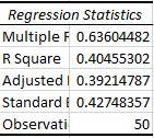
The output from the regression contains the above table, indicating the coefficients and relative significance. Here it can be seen that the coefficient of the dlmilk variable is .2307 (95% confidence level is between .149 and .312) and it is significant, since the p-value is much less than .05 (6.9E-7). The intercept is estimated to be 3.5873 (95% confidence level between 2.966 and 4.209). The least-squares regression line is only explaining about 40% of the variation, as indicated by the R-squared value.
So the equation of the least squares regression line is weight=3.5873+dl.milk*.2307. This can be used to create a column of predictions as necessary.
Conclusion
We hope you found this guide to simple linear regression in Excel useful!
